Resources & Insights
Browse through our collection of free resources.
You'll find eBooks, whitepapers, actionable templates, checklists, worksheets and more.
Articles
)
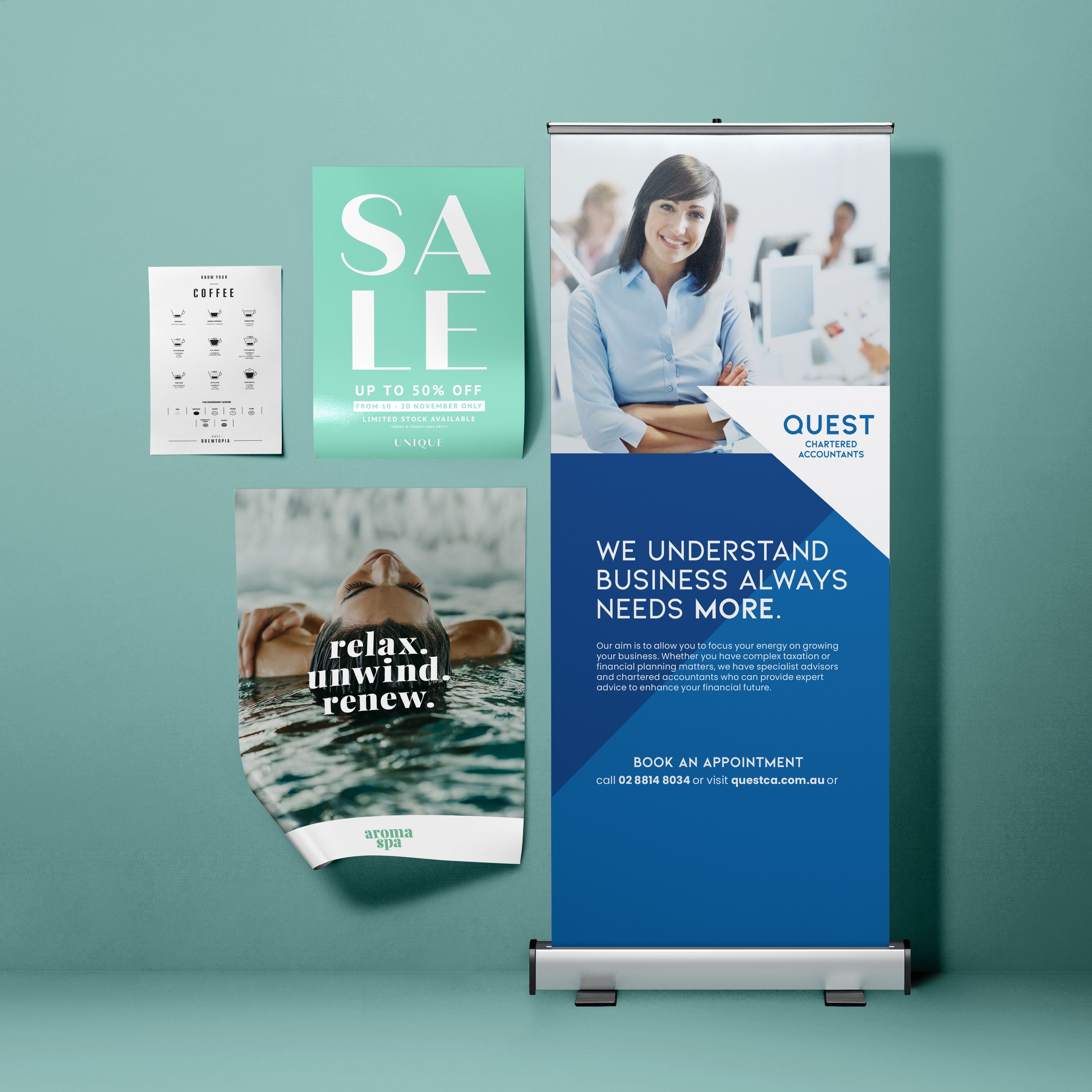
Flyers may seem old-fashioned, but they do what many ads can’t: deliver your message straight into someone’s hand. The...
)
Think of the last time you picked up a flyer at a café, received a postcard in the mail or walked away from an event with...
)
Printed brochures are an effective means of sharing information and introducing your business in a professional, physical ...
)
At almost any networking event, trade show or client meeting, you will still see people exchanging business cards. Even wi...
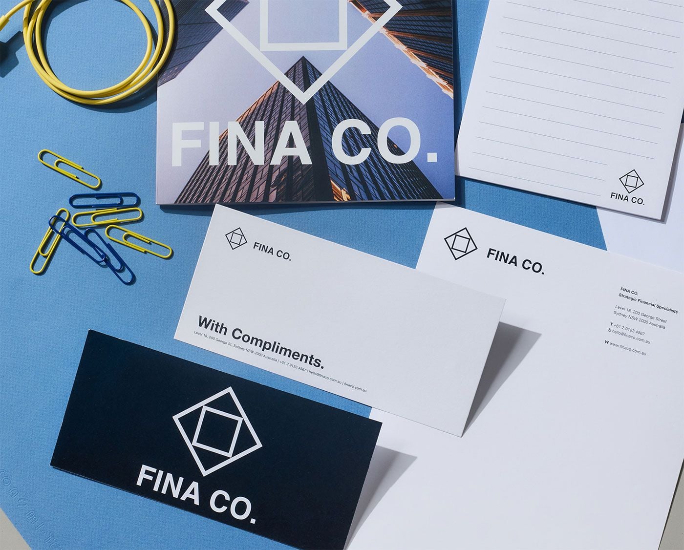)
All business inventory needs managing, and branded stationery is no exception. By keeping track of what you have, how much...
)
Some projects are just too big for a regular printer. When you need a sign you can see from across the street, a banner th...
)
Direct mail marketing in real estate remains one of the strongest ways to get your message in front of property buyers, se...
)
Getting people interested in an event doesn’t start on the day. It starts weeks, sometimes months, before it happens. Th...
Print remains one of the most effective ways to connect with customers across a wide range of demographics. However, not a...
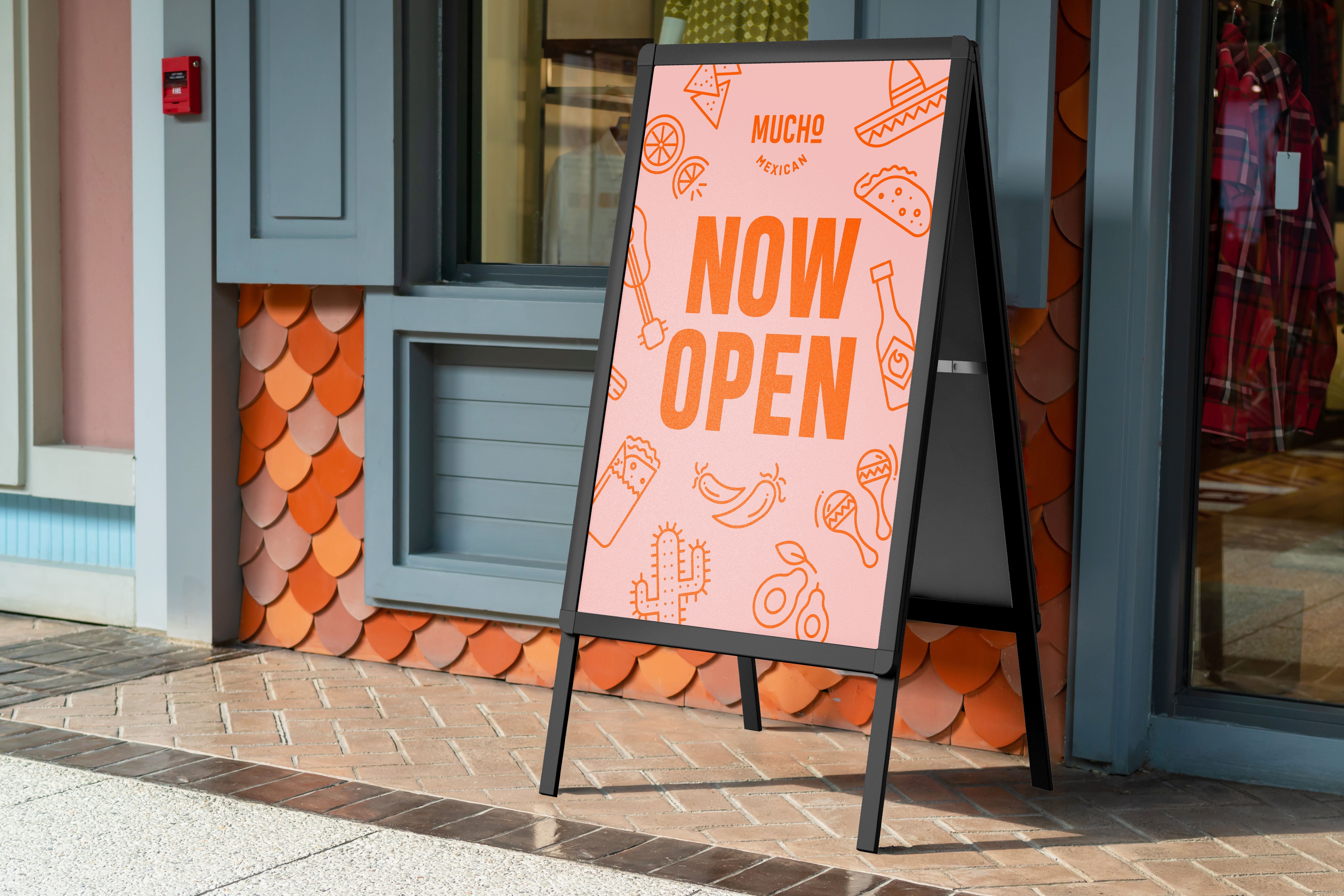)
Your signage is often the first thing people notice, and it's your first chance to make a lasting impression. When you can..
)
Think about the last time you saw mismatched business cards, clashing presentation slides or off-brand signage. It lingers...
)
The paper you choose for your prints is more important than you might think. It shapes both the look and feel of your fina...
)
Walk into any busy shop and you’ll notice something at work before a customer even reaches the register: strategically p...
)
The Top 20 Products To Best Promote Your Business in 2026Your promo materials must be impactful enough to stand out in a s...
)
If you require signage that is easy to transport, simple to set up and easy to read, pull-up banners are a top choice. The...
Resources
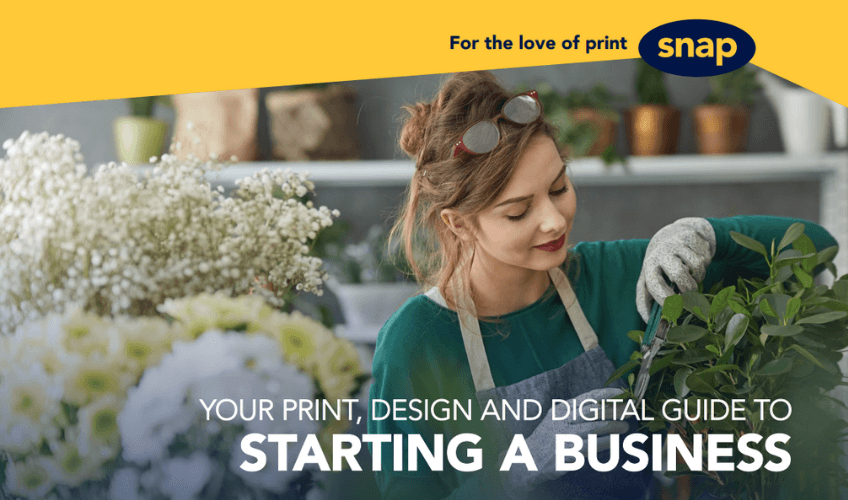)
So, you've got a great business idea and you're ready to make it happen. Excellent! But what comes next?
Turning your v...
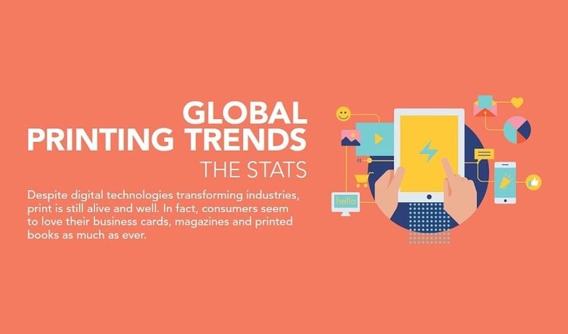)
Evolving print: How our print favourites have changed
Thanks to new technologies, changing trends and more, the print...
)
It's time to show your employees how much you appreciate them and let customers know you're in business with a bold, tangibl...
)
After months of coronavirus-enforced shutdowns, bricks-and-mortar businesses are reopening across the country. But how do ...
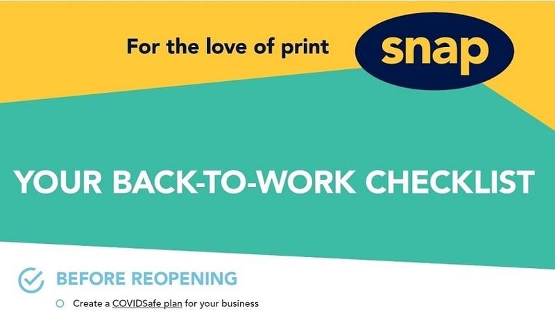)
Business owners across Australia are ready to get back to work post the COVID-19 lock-downs. But what do you need to do...
)
When it comes to hiring a new employee, a comprehensive onboarding kit can be essential.
Not only does it help them s...
)
A sales manual is a valuable training tool that can help your team sell more - and sell well. Not only should it give t...
)
Versatile and eye-catching, print is one of the most effective ways to draw customers' attention to your bricks-and-mort...
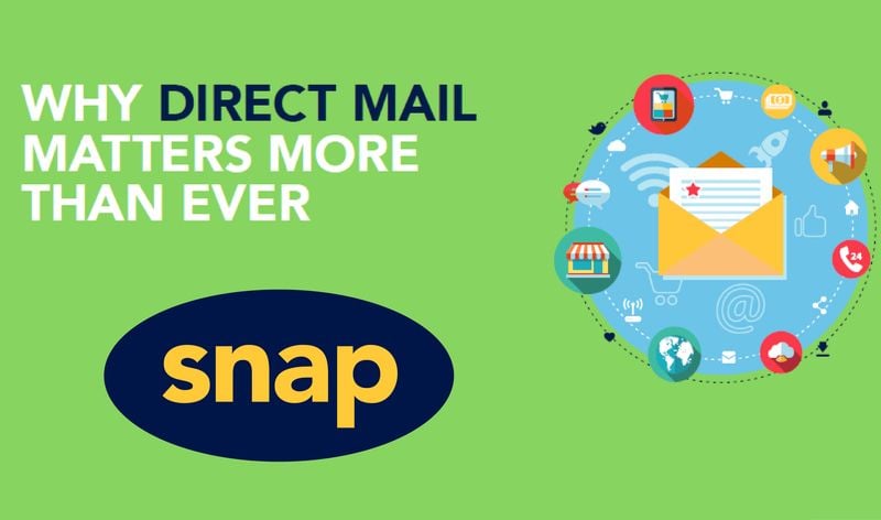)
A large part of the world may have gone digital, but we still love checking the letterbox. Download our free infographic t...
)
Business stationery isn't just a practical necessity. A consistent suite of items can help keep you front of mind and put y...
)
Your pages are all printed and trimmed, but they're missing that finishing touch? Read on to learn which kind of binding wo...
)
Choosing the right finish for your print job can be a headache. In this info sheet, we reveal the difference between matte...
)
If you're looking to print big, you'll soon notice it comes with a whole new set of considerations. Here are some key aspect...
)
Custom signage can help draw more visitors to your stand, which increases your chances of generating more viable leads for...
)
Once expo season is in full swing, it's easy to get overwhelmed. This free checklist is sure to keep you on track.
Click h...