How to make your message stick
)
So how do you create a successful sticker, decal or label? Contrary to what most people think, there's more to sticker design and printing than meets the eye. We've put together some pointers on what to consider to ensure the final product is exactly what you are after.
Objective of your stickers
Is your sticker objective to build brand awareness, communicate a call to action or simply sweeten your customer's experience when they open your parcel? Knowing your objective will help you design your own stickers and choose the right type of sticker for your application
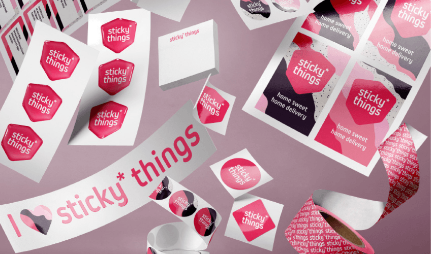
Make sure your stickers match the rest of your branding
This might seem obvious however it's key to making sure your stickers look professional. Your stickers ideally need to feature your logo, font, brand colours and overall brand personality. If you're brand is a little funky and cool, perhaps you want to demonstrate this by having a unique die-cut shaped sticker to reflect your company's personality. Our team of designers are able to help you develop your brand and sticker design if needed.
Think about the size and shape of your stickers
You have the option to choose from standard shapes, like squares, rectangles or circles, or create a unique shape just for you. A unique shape will add a little to the cost but if it creates an impact and matches your brand then don't dismiss this option. Think about the size too. For example, if you're wanting a sticker for a box, how big is the box? Make sure the sticker is not dwarfed by the packaging. Or if you are giving away branded stickers in your shop make sure they are small enough to slip into a shopping or handbag. Knowing where your sticker will be used will help determine the best size, shape and printing method.
Simple stickers work best
Cramming a sticker full of content will make it look messy. A sticker's design needs to be simple but eye catching. Usually stickers are only seen for a few seconds so it's imporant not to have a long text message. Use text sparlingly and focus more on colour and visual elements. Stickers are often noticed from afar so any text should use bold typography. If it takes an effort to read, people won't bother. Also don't take up all the space with your design, allow for some plain areas - leave all the detail for your website and brochures. Depending on the size of the sticker you may want to include one connecting element such as a web address, social media handle or the increasingly popular QR code.
Focus on the technical nitty gritty
If you are designing the sticker yourself, be sure to leave a 5mm bleed around the edge to ensure your design isn't cut off. Also the artwork needs to be in CMYK not RGB otherwise your print could look very different to the design on your computer screen. Lastly, think about how sticky you want your sticker to be. If your customer needs to remove your sticker you don't want their first experience with your brand to be one of frustration when they can't get it off easily. If you don't want to think too deeply about bleed, colour space, adhesives or file types, our SNAP team will be happy to work out all technical side of things and take these hassles off your plate.
To ensure you have the sticker that meets your objectives, consider the above points and talk to your local SNAP Centre. We're here to craft your ideas into amazing stickers that hit the mark. Check out our sticker eBook for inspiration.
Related Blogs
 "10 Tips for Designing an Eye-Catching Flyer")
 "What Type of Marketing Materials Will Help My Business?")
 "When You Should Use Tri-Fold and Bi-Fold Brochures")