Colour Psychology for Poster Design
)
Choose the right colours for your posters with these psychology-based tips.
The psychology of colours and advertising: what it means for your poster designs.
Whether you realise it or not, colour psychology probably has an impact on you every single day. It’s certainly not by chance that a particular poster catches your eye and makes you take action - rather, it’s often due largely to the colours used in the design.
There’s a very strong link between colours and emotion... and you can use that to your advantage in your poster designs. The good news is that colour psychology is well-researched, so the information you need to choose the best colours for your marketing is right at your fingertips. From small-scale prints to large-format displays, such as A1 posters, the right color choices can capture attention, create a desired emotional response, and ultimately drive action.
In this article, we’ll break down what you need to know about colour psychology and using colour in your poster designs.
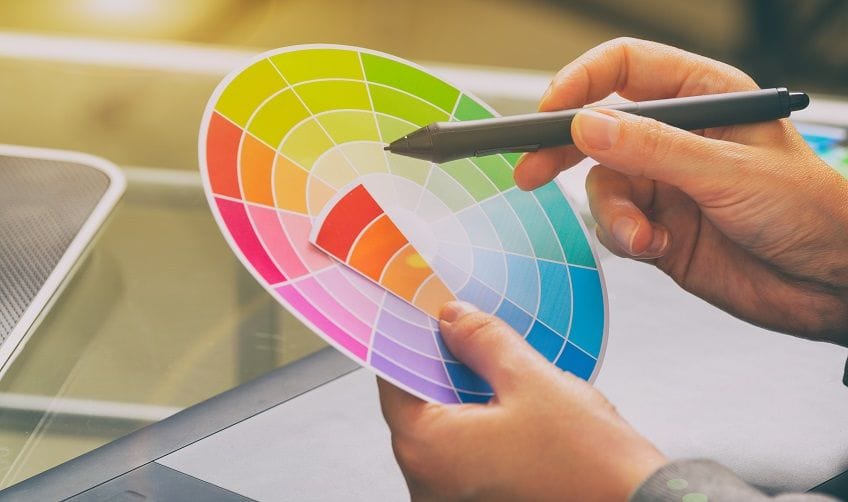
Colour wheel 101
The primary colours - red, yellow and blue - form the base of the colour wheel. Then, the secondary colours come from mixing equal amounts of two primary colours together to give you orange, purple and green.
Finally, there are tertiary colours which involve mixing two of the primary colours together in unequal amounts (eg. one part blue with two parts red).
Beyond these, there are tints, shades and tones. These are what happens when you add white, black or grey, respectively, to one of the pure colours.
Then, within the colour wheel, you also have warm colours - red, orange and yellow, and cool colours - blue and green.
The colour wheel is a really useful design tool for choosing colours. It enables you to easily choose contrasting or complementary colours, depending on what you’re trying to achieve.
But first, you need to understand the psychology behind it all.

The psychology of colours
The amazing thing about colour is that different colours have been reliably shown to trigger different emotional responses. Those responses can also be affected by personal experiences - so they’re not exactly the same for every person. However, there are some common, well-accepted connections between different colours and the moods they evoke.
These include:
- Blue: trust, serenity, loyalty, reliability and focus
- Red: passion, vitality, sensuality, energy and power
- Yellow: positivity, joy, warmth, creativity and enlightenment
- Pink: romance, femininity, tranquillity, happiness and compassion
- Black: power, strength, elegance, mystery and drama
- Orange: confidence, success, warmth, fun and energy
- Green: harmony, healing, tranquillity, growth and balance
- Purple: luxury, ambition, wealth, loyalty and magic
- Brown: ‘groundedness’, comfort, reliability, trustworthiness and conservativeness
- White: purity, simplicity, honesty, equality and peace

How to choose the right colours for your poster designs
Choosing the best colours for marketing materials isn’t simply a case of pointing your finger at the emotions you want to evoke and then using those colours. Instead, you need to balance the relationships between different colours on the colour wheel with the psychology behind those colours. Don’t worry though: this is simpler than it sounds.
Start by thinking about the messages you want to convey. Generally, a high-contrast colour pairing will work to help a message stand out. For this purpose, opt for colours that are opposite each other on the colour wheel. Alternatively, if you want a more balanced poster design, choose complementary colours that sit alongside each other on the colour wheel.
Also consider how the colours will impact the readability of any fonts you choose. For example, yellow text on a white background is very difficult to read, so it’s best to avoid this.
As with anything in design, less is usually more. Yes, using a rainbow of colours in the design might be called for in some cases. Even if you’re opting for one of the bigger poster sizes and have more space to play with, it’s generally best to only stick with two or three colours and use those well in the design. You could begin with your existing brand colours - or take inspiration from the Pantone Colour of the Year, as this is chosen to reflect the global culture.
It’s impossible for us to tell you exactly which colours to use in your poster designs. However, if you do need that extra step of assistance, we’re always here to help. Your local SNAP Centre has professional designers available to ensure you make the most of the power of colour psychology in your designs.
Posters made simple with SNAP
At SNAP, we’ve been in the print industry for more than 120 years, so we’re experts on colours and advertising.
Use our in-house design experts to help you master colour and emotion in your designs.
Then, once your design is ready, you can order poster prints to collect from one of our 132 Snap Centres around Australia - or have them sent out to you. It’s really that simple.

)
)
)

