5 Tips - Choosing the Best Poster Fonts
)
A simple guide to poster fonts and how to choose them
The right fonts can be the difference between success and failure for your poster design. And with the plethora of fonts available, it can be hard to know which is best for your purposes. The good news is that we’ve got some simple tips for choosing the right poster fonts. Following them will put you well on the way to conveying a strong message and ensuring your poster stands out.
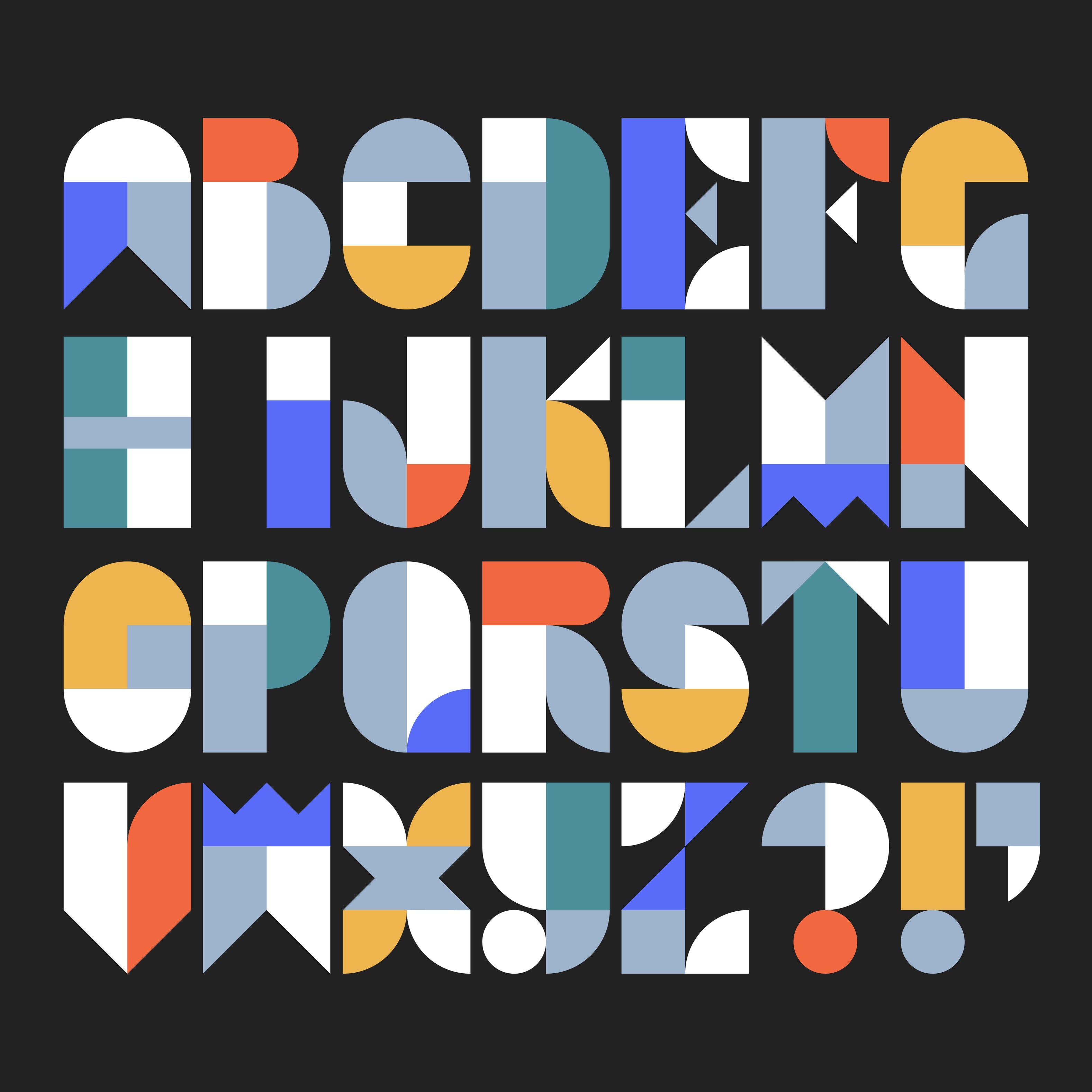
Tip 1: Use the right number of font styles
Using only a single font on your poster will have less impact compared to using multiple fonts. Beware though: this is a balancing act. We recommend using two or three different fonts at most. More than that will likely just create a distracting mess, while fewer risks looking bland.
The key to using different poster fonts well is to create some kind of order or structure for them. Give each font a role on the page - heading, subheadings, body text, etc - and then use that font consistently in that role.
Consistency is king, and it helps the person viewing your poster to subconsciously understand what each text block is doing.
Tip 2: Also use different font sizes
There may be a case for only using a single font size in your poster if it has a highly specific intent. In that case, you could use the single font and size as a tool to convey that intent.
Generally speaking, however, you need to assign different font sizes to different elements on the page. This keeps the design interesting and cues your audience into what’s most important.
And, as with the font styles, keep the sizes you allocate to different element types consistent. If you use 35pt for one subheading, use exactly the same font size for all other subheadings on the poster.
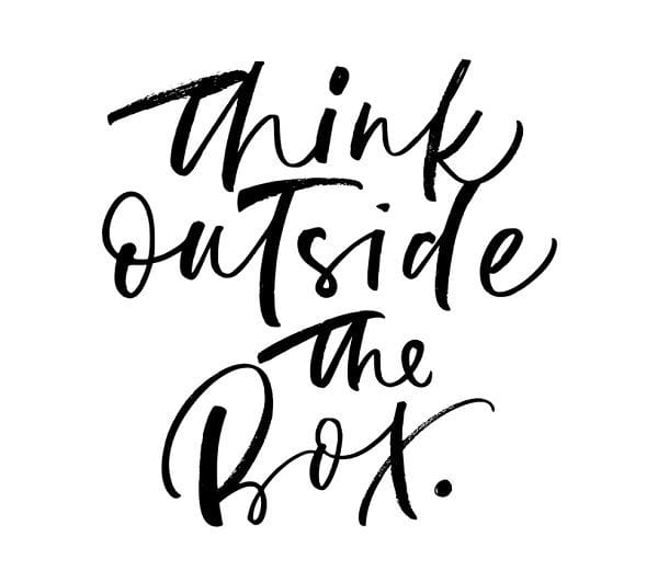
Tip 3: Make sure your fonts are readable
At the end of the day, even if the fonts you use look amazing on screen, people need to be able to read the text once your poster is printed.
Script or lightweight fonts can be the worst culprits for illegible poster text. Be aware too that most people find sans serif fonts more readable than serif fonts. These fonts are more streamlined with less variation in character widths, and they don’t have any serifs (i.e. brush strokes) at the edge of each letter.
However, also consider how large your finished poster dimensions will be, as this will affect the best font style and size for it. Always either view your poster on screen at the actual print size, or print a proof so you can see how it will look on paper before you complete your print order.
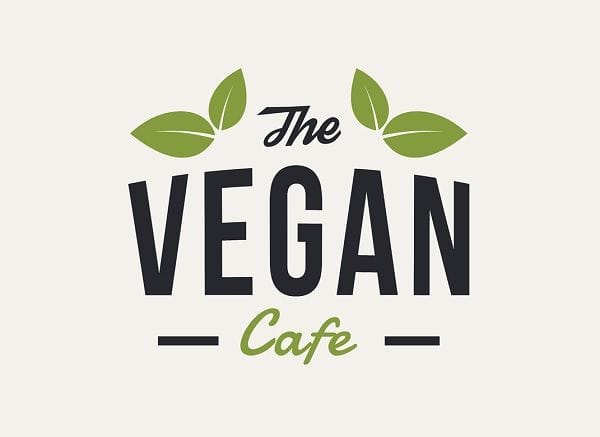
Tip 4: Get to know some classic font combinations
You’re not on your own when it comes to choosing different fonts for your posters. Over the years, professional designers have come up with some tried-and-tested combinations that work a treat.
Many design tools offer pre-made combinations that you can use in your own poster designs. If you’re new to design, it’s probably best to stick with one of these combinations, as you know it will work.
Or, if you’re using a design program that doesn’t provide these suggestions, we recommend choosing one of the classic combos. Perhaps try pairing sans serif fonts such as Futura or Franklin Gothic with more decorative fonts like Hello Beautiful or Bodoni.
Tip 5: Match the font to the message
Choosing the right poster fonts isn’t just about considering how the poster looks aesthetically. If your font conflicts with your message, your poster will have far less impact.
For example, choosing fun fonts for a poster that’s supposed to convey a serious message could make you seem flippant and reduce your credibility. In the same way, plain fonts won’t work if you’re trying to get people excited about your message.
Instead, think about your message and its tone, then choose fonts that will support or enhance them.
Poster fonts made easy with SNAP
At SNAP, we’ve been in the business of print for more than 120 years. So when it comes to poster fonts (and all things posters), we’re here to help.
Ordering your poster prints from us couldn’t be easier. You can upload your own design or if you need a bit more help, our in-house designers can take care of the design for you.
Then, once you’ve finalised your design, simply place your order. You can collect your posters from one of our 132 SNAP Centres around Australia or have them sent out to you.
)
)
)