The History of Product Labels
)
Today’s product labels tell your story. They communicate brand identity, influence buying decisions and help products stand out on the shelf. Customers often make split-second decisions based on the look and feel of a label, especially when comparing similar products.
Despite the evolution of buyer expectations and packaging trends, labels remain one of the most effective tools in your marketing kit. They're small but mighty, and their impact has only grown stronger over time.
To understand where labels are heading next, let’s take a step back and revisit their past. From early apothecary labels to colour-bursts and multi-font illustrations, the art of product labels has come a long way over the years. But how much has it changed? In our blog, you will learn the history of labels and the evolution of their designs.
Product Label Design Trends Over The Years
The evolution of product labels correlates with advances in printing and design. As new techniques emerged, so did new styles. What started as a simple identification became an opportunity to stand out and influence the way people shop. Below, we explore the major design trends and innovations that shaped the history of labels.
1700s: Early labels
In the 1700s, product labels were used for basic identification. They often appeared on apothecary bottles and listed the product name, the supplier and, occasionally, instructions for use. These were printed using woodblock or letterpress techniques on handmade paper. The focus was more on function, rather than flair or aesthetics.
1800s - 1900s: The colour revolution
The 19th century introduced lithography, making it easier to print detailed and colourful product labels. This gave businesses a way to stand out with decorative borders and stylised designs. As more industries adopted labelling, the visual impact of a product became just as important as the product itself.
1900s: Intricate artworks
In the early 20th century, labels became a marketing tool. Instead of using plain layouts or basic descriptions, brands began investing in expressive hand-drawn portraits, decorative flourishes and catchy taglines.
1920s - 1930s: Illustrated labels
Advancements in printing paved the way for brighter colours and sharper detail. Illustrations were the preferred method for showing imagery because photography was still not practical for label production. During this time, labels told stories through bold characters, colour schemes and artistic layouts.
1950s: Pin-up labels
The 1950s brought pop culture into label design. Pin-up girls, already popular in advertising, began appearing on labels for everyday goods. Novel and eye-catching, this ultimately matched the playful tone of the decade’s advertising style.
Pin-ups are often illustrated with bold colour palettes and stylised poses. They brought a sense of fun and familiarity to packaging, especially in categories like beverages, chewing gum and household goods.
1960s - 1980s: Fonts up Front and Centre
Bold fonts and graphic layouts became more common. Typography moved into the spotlight while portraits and hand-drawn elements began to fade. Brands leaned into strong colour combinations and large lettering to grab attention.
This era prioritised efficient labelling more than any other aspect. With more products competing for space on supermarket shelves, labels needed to be instantly readable and visually bold. Sans-serif typefaces, geometric shapes and high-contrast colour schemes dominated the era to make recognising and recalling brands easier for consumers.
Present Day: Modern minimalism
Today’s product label design leans into simplicity. Clean fonts, generous white space and minimal detail give products a refined look. Instead of shouting for attention, labels now aim to build trust and clarity. QR codes and smart labels are conveniently digital, keeping the design sleek and functional.
With over 300 years of change behind them, product labels continue to adapt with the times. There's more room to get creative with the tools and materials now readily available.
Request a quote today to learn more about your product label options.
Current Product Label Design Trends
Each design shift - from detailed illustrations to minimalist layouts - can be attributed to changes in technology, consumer behaviour and branding strategy. Today’s trends reflect a demand for clarity and connection. Here are the styles that are shaping product labels now.
Clear and minimalist designs
Minimalism has taken over packaging. Clean layouts, soft colours and simple typography are being used for transparency. Brands are focusing on legibility and space to lessen noise and let the product speak for itself. This trend works especially well in the health, wellness and tech sectors, where clarity is part of the value proposition.
Sustainable and eco-friendly options
Consumers are more conscious of packaging waste, and product labels are evolving to meet those expectations. Labels are now being printed on recycled, biodegradable or compostable materials. Some brands are also choosing uncoated papers and water-based inks to lower their environmental impact.
Personalisation
Digital printing has made customisation more accessible. Brands can now tailor product label design by batch, region or even individual customer. Think names on bottles, limited-edition runs or location-specific variants. Personalisation helps create stronger and more meaningful brand connections.
You can explore how personalised labels fit into your larger marketing strategy through our marketing print solutions.
Interactive packaging
Smart labels are on the rise. QR codes, NFC tags and AR-enabled graphics let customers scan a product to gather more information, such as usage tips or brand stories. This feature adds value to the product label without cluttering the design.
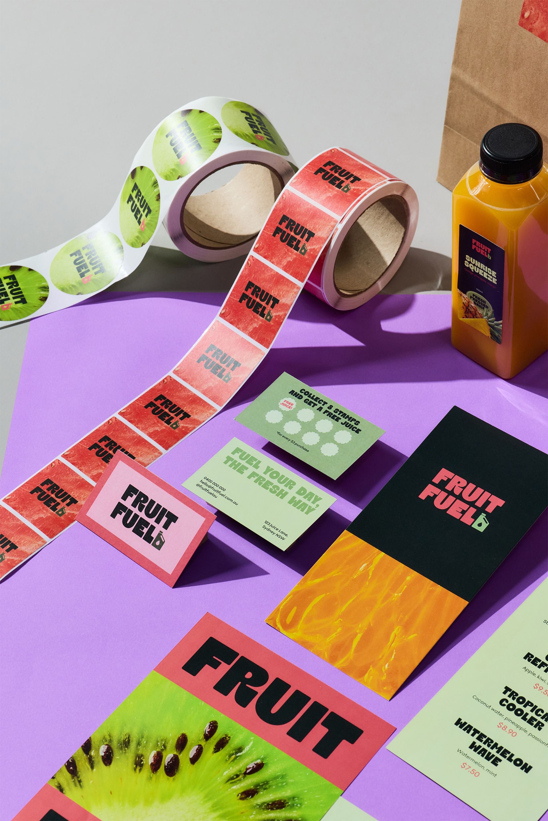
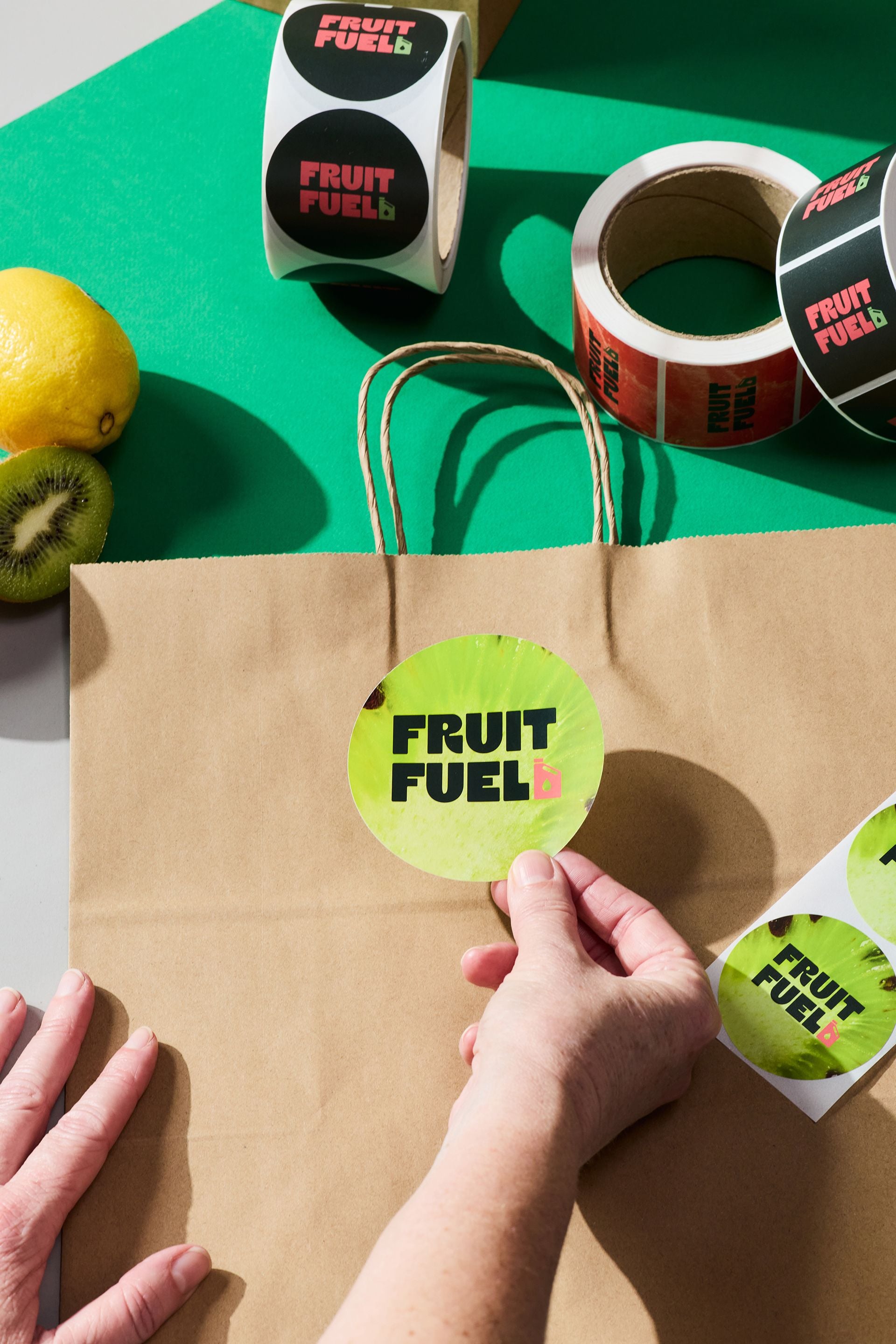
Bold typography and limited colour palettes
Some brands are leaving complex imagery behind and relying on oversized fonts paired with just one or two colours. This technique makes the product easier to identify on shelves and gives the label a memorable identity.
Transparent and “no label” labels
Some brands are leaning into ultra-simplicity by using clear labels or printing directly onto packaging. This trend works especially well for beverages, cosmetics and wellness products where the product itself is part of the appeal. It creates a clean and high-end look while also reducing materials and visual clutter.
Vintage and nostalgic designs
Throwback labels are making a comeback. With retro fonts, heritage-inspired layouts or sepia tones, this trend taps into the power of nostalgia. Brands use it to create emotional connections and add perceived authenticity. It’s especially common in food, alcohol and boutique product categories where story and heritage carry added weight.
Create product labels that stand out with Snap Print Solutions
Designing standout product labels requires a print partner who understands how to bring your brand to life on paper, foil or film. After all, substrate choice plays a key role in design decisions. At Snap Print Solutions, we prioritise both creative thinking and print precision to help you craft labels that are clear, eye-catching and effective.
We offer end-to-end solutions that align with your goals. From graphic design services to commercial printing services, we have the tools and experience to make your label work hard on every shelf it lands on.
Contact your local Snap Print Solutions Centre to learn more or explore our online printing services for fast, reliable support with your next label run.
Related Blogs
 "10 Tips for Designing an Eye-Catching Flyer")
 "What Type of Marketing Materials Will Help My Business?")
 "When You Should Use Tri-Fold and Bi-Fold Brochures")