How speciality inks can make your prints pop
)
If you're looking for a way to up the ante on your flyers, books and brochures, speciality colours may be the way to go. These luxurious metal inks are here to freshen up your colour palette and transform your printed pieces from great to grand. Here's how speciality colours work.
What are speciality colours?
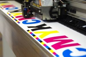
Speciality print colours are colours that lie outside the CMYK colour spectrum. CMYK stands for cyan (blue), magenta, yellow and key (black). These are the base colours that are used to produce any shade on the rainbow. However, some tones for example gold and silver can't be mixed from these due to their metallic characteristics.
You can apply these inks either individually as a so-called spot colour or mixed with other shades of the CMYK spectrum. Gold and silver pigments can, for example, be applied above or below a CMYK print to intensify the effect of a certain colour. This can add a shiny, metallic effect to your final result.
Metallic inks vs. foil printing
Another way to achieve metallic effects on your designs is to use foil printing. Here, shapes are cut out of metallic foil stock and stamped onto the paper using heat and pressure. This technique is typically applied after the fact, on top of the printed piece. The result is usually a high-shine and textured piece of work. However, using too much foil for example, by colour blocking can take away from the luxurious feel you're after.
Pre-mixed speciality inks, on the other hand, are applied in a similar fashion to CMYK colours. They are rolled onto your stock as the paper glides through the printing press, giving your finished product a more subtle yet extremely high-end finish. This makes speciality inks generally more suitable for intricate and complex designs of both the big and small kind.
However, if you're planning on incorporating other speciality printing options, like embossing, to your project, you might be better off opting for a foil print over a speciality colour. That's because metallic inks actually contain small amounts of metal particles that can crack in the process (or once dried) due to the heat being applied.
How does it work?
A regular printing press has four colour compartments one for each of the four base colours mentioned earlier. If the press has the ability to print speciality colour, it has one additional compartment where the printer can place speciality ink. However, it's unlikely you'll be able to print both in one pass. That's why, in most cases, adding metallics or other special colours to your print requires multiple print runs.
This means that the person printing likely has to stop and restart the print job to pass the paper through a second time in order to print the special colour. When using more than one speciality colour on one page, you'll need to print all of them separately so the printer can change the ink between the runs. Needless to say, this involves quite a bit of manual labour, which can add to the production time and costs of your print item.
Why the future of speciality inks is now
The good news is that production press manufacturers have eagerly been working on solutions to make the printing of speciality colours more effortless and more cost-effective. First to the market has been Fuji Xerox, who recently launched a six-colour production press to help streamline production processes for commercial printers.
Named the Fuji Xerox Iridesse, the press offers two additional interchangeable colour compartments for gold, silver, clear and white toner. The set-up and cooling processes of the machine allows printers to produce orders that include speciality inks in one single pass, minimising manual labour and the overall production time drastically.
Adding speciality colours to your design can give your print that certain je ne sais quois you've been looking for. Why not try it today?
Talk your local Snap Centre to learn more about how to make your prints pop.

)
)
)

