10 cool SME logo designs that are also super effective
)
Considering a first or refreshed logo for your business? It's a project worth putting a lot of thought into.
After all, your logo isn't just the public face of your business in the physical and online worlds.
It's a symbol that can make a powerful impression on customers, staff, suppliers and anyone else who's important to your success.
In good ways, or bad.
Three goals of a logo
Everyone wants a logo that's recognisable, creative and represents their brand perfectly.
But that's not an easy trifecta to achieve without the help of an experienced graphic design professional.
Plus, the kind of logo you need will depend on what your company does and the brand message you want to communicate.
But you don't need to be a big business with a fat budget to have logo that turns heads, builds trust and speaks volumes.
Here are 10 logos of small businesses (plus one that grew big really quickly) that do it well. And you can too.
Colours are memorable
The three logos below perfectly balance eye-catching with brand and industry association through a blend of symbols, fonts and words.
This is particularly important when you are a new or lesser known business.
Studies show that colour is often the logo detail that people remember best and can boost recognition up to 80%.
The logos below for retail food businesses, Yetito and Let It Beet, express their brand personalities through fun colours and imagery a mascot and casual cutlery illustration - rather than a more traditional and serious elements.
The architect firm below uses colourful dots as a symbol of creativity and uniqueness (change), against a black background to represent professionalism and style.
Promote your offer
Your logo can also express the benefit you provide.

Lumosity is website that helps people train their brains by playing fun games. Their logo suggests this and that the brand itself is smart.
Baby sleep products company, Luna Lullaby, has logo elements and colours that convey a soft, night time feel.
Stand out with creativity
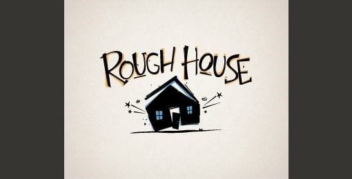
Video production company Rough House cleverly incorporates a sense of motion in their logo.

Shoot my Dog's logo includes double images that match the brand - someone taking a photo, and the photographer looking like a dog.
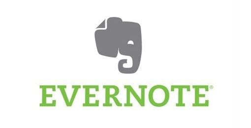
Bonus logo: Not a small business anymore, but we love the Evernote logo too much not to include it anyway.
The world's favourite note taking and content saving app uses an elephant head with a curled-up trunk to:
- symbolise a long memory
- represent page fold in the ear
- make the logo instantly recognisable.
Whether you're creating a new logo, or redesigning your 'face of the business', it's important to put some thought into the design so that it turns out:
- recognisable
- creative
- perfectly reflects your business and brand personality
If you need professional help with logo design, talk to your local Snap Centre graphic design experts.
)
)
)

